The home dashboard ships with three read-only visit-flow charts: a doughnut for what is happening today, a line chart for the rolling 7-day window, and a bar chart that breaks the same week down by status. They are meant for at-a-glance triage, not deep slicing. For per-office, per-payer, or per-caregiver cuts, use the Reports page.
Quick answer
Open the dashboard. The Visit Status doughnut sits to the right of the Today's Visits table and covers today. Below that row, the Visits Over Last 7 Days line and the Visits by Status bar chart sit side by side, both covering the rolling week. Hover any segment, point, or bar to see the underlying counts.
1. Locate the chart band on the dashboard
Find the Visit Status doughnut to the right of Today's Visits.
The doughnut card lives in the right column directly across from the Today's Visits table. It is the first chart on the page.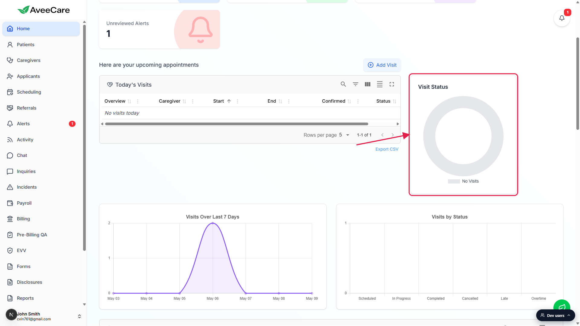
Look one row down for the line and bar charts.
Visits Over Last 7 Days sits on the left, Visits by Status sits on the right, each in its own white card. Together with the doughnut they make up the chart band.
2. Read the Visit Status doughnut
The doughnut breaks today's visits into Pending, Completed, and Cancelled.
The three slices are Pending Visits (blue), Completed Visits (green), and Cancelled Visits (orange). The legend underneath names each color. The doughnut counts today only, not the whole week.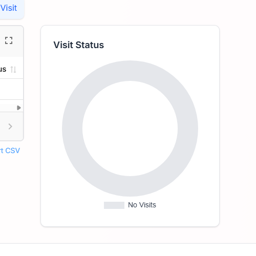
On a day with nothing scheduled, the doughnut shows a No Visits empty state.
You will see a flat grey ring with a No Visits legend chip. That is expected, not a bug. Tooltips are disabled in the empty state.Hover any slice for the underlying count.
The tooltip surfaces the slice label and the visit count. Hover does not work on touch devices, tap a slice instead or use the desktop dashboard.
3. Read Visits Over Last 7 Days
The line chart plots total visits per day across the rolling 7-day window.
Each x-axis tick is a date in MMM dd format (for example, May 06). The y-axis auto-scales to your busiest day. A flat line at zero with one peak just means you have one busy day in the window and six quiet ones.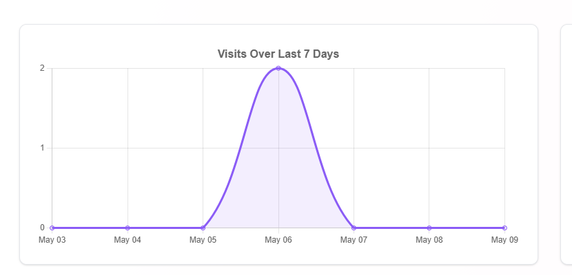
Use the line to spot load shifts.
A holiday dip, a Monday spike, or a sudden drop after a scheduling change is easy to read off the curve. Hover any point for the exact count on that day.
4. Read Visits by Status
The bar chart slices the same 7-day window into six status buckets.
The categories are Scheduled, In Progress, Completed, Cancelled, Late, and Overtime. Each bar is the count of visits that ended in that status across the last 7 days.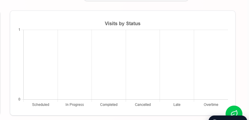
Tall Cancelled or Late bars deserve a follow-up.
Cross-check the Recent Alerts panel and the Activity feed for context, and review your Visit Monitoring thresholds in Settings if Late spikes regularly.
Common pitfalls
- Reading the doughnut as 7-day data. It is today only. Pending plus Completed plus Cancelled equals today's total visit count, nothing more. The line and bar charts are the 7-day views.
- Expecting filters. The dashboard charts are agency-wide and unfiltered. To slice by office, payer, or caregiver, use the Reports page.
- Trying to hover on mobile. Hover tooltips do not fire on touch devices. Tap a slice or bar to surface the value, or open the dashboard on desktop for hover behavior.
- Treating a bar y-axis of 1 on a slow day as real load. Chart.js auto-scales the y-axis to a minimum of 1 even when every category is zero. The bar heights themselves are still zero, hover any bar to confirm.