Analytics is the recruitment-side dashboard for your hiring pipeline. It shows how many applicants are in the pipeline, conversion rate, where the best candidates come from, who has the heaviest recruiter workload, and how long hires actually take. Use it to find the bottleneck.
Quick answer
Open Applicants and click the Analytics tab (rightmost of the four tabs). Four KPI tiles run across the top: Total Applicants, Onboarded rate, Avg Time to Hire, Attrition. Below them sit five panels: Pipeline Funnel, Source Effectiveness, Active Pipeline by stage, Recruiter Workload, and Time-to-Hire Trends.
1. Open the Analytics tab
On Applicants, click the Analytics tab.
The page has four tabs: Pipeline, All Applicants, Archived, and Analytics. Analytics is the rightmost one.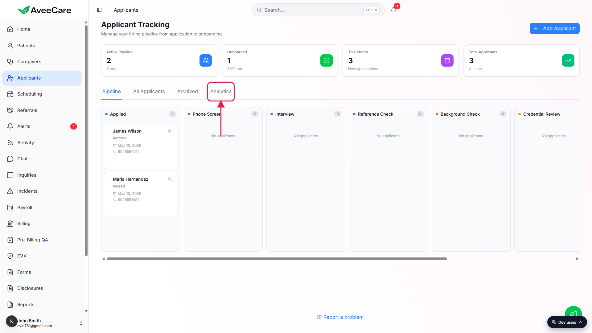
2. Read the KPI tiles and Pipeline Funnel
Four KPI tiles run across the top of the Analytics tab.
Total Applicants with the active count beneath it. Onboarded with a percent rate (onboarded divided by total). Avg Time to Hire in days, with the min-to-max range underneath, or a dash and No data until you have at least one onboarded applicant. Attrition with rejected and withdrawn counts broken out below.Pipeline Funnel charts the count at every stage.
Stages on the left axis: Applied, Phone Screen, Interview, Reference Check, Background Check, Credential Review, Offer Extended, Training, Onboarded. The Onboarded bar is green so the success end state stands out. Rejected and Withdrawn counts sit on a footer row beneath the chart so you can see attrition without losing the funnel proportions.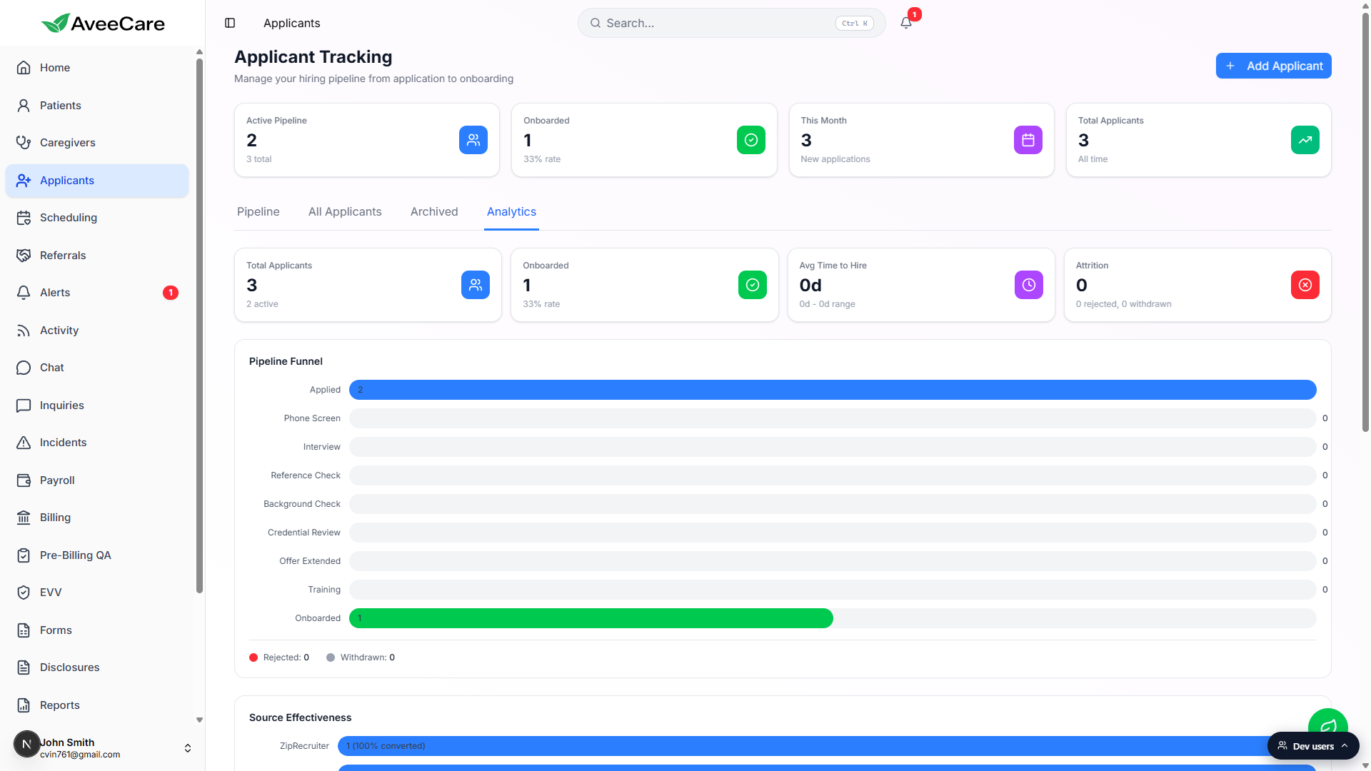
3. Check Source Effectiveness and Recruiter Workload
Source Effectiveness shows where applicants come from and how well each source converts.
Each row is a value from the Application Source dropdown (ZipRecruiter, Indeed, Referral, Walk-In, Career Fair, and so on). The bar shows total applications from that source, and the label inside reads N (X% converted) where X is the onboarded rate for that source. The list is sorted by total volume. If no applicants have a source set yet, the panel shows No applicant data.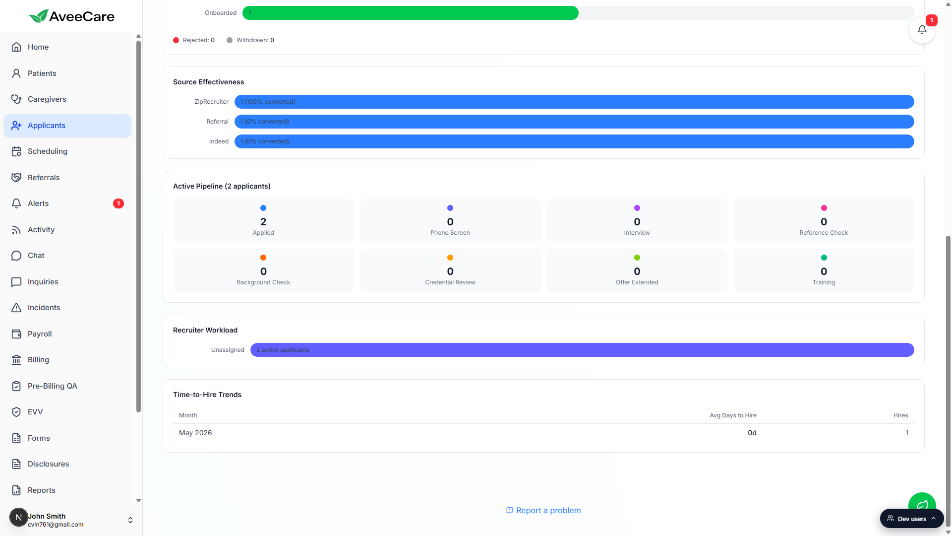
Active Pipeline breaks the in-flight count down by stage.
A grid of small cards, one per non-terminal stage, with the live count in each. Onboarded, Rejected, and Withdrawn applicants are excluded so you only see who is still moving.Recruiter Workload sorts your team by active applicant count.
One bar per recruiter, sorted highest first. Applicants with no assignee group under Unassigned. Use this to spot a recruiter buried in candidates and rebalance assignments.
4. Track Time-to-Hire Trends month over month
Scroll to Time-to-Hire Trends, the last panel on the page.
A table with three columns: Month, Avg Days to Hire, and Hires. Each row is one calendar month, sorted oldest first. Avg Days to Hire is computed from days between the application date and the converted-to-caregiver date for every applicant onboarded in that month. The panel reads No onboarded applicants with hire date data until you have at least one converted applicant.
Common pitfalls
- Avg Time to Hire shows a dash. The metric needs at least one applicant who has reached Onboarded with both an application date and a converted date on file. Until then the tile reads 0d or a dash and the subtitle says No data. Convert one applicant end-to-end and the metric populates.
- Source Effectiveness is empty. If your applicants do not have an Application Source filled in on the Add Applicant form, this panel stays blank. Make Application Source a required field for your recruiters so the chart actually has data.
- Funnel counts look low. The Pipeline Funnel shows the number of applicants currently sitting in each stage, not the cumulative count of everyone who ever passed through. An applicant who moved Applied to Phone Screen counts on Phone Screen, not Applied. If a number looks off, cross-check against the All Applicants table.
- Recruiter Workload says Unassigned. Applicants with no assignee fall into the Unassigned bar. Open the Pipeline tab and assign each card to a recruiter so this chart actually splits across your team.
- Time-to-Hire only counts onboarded applicants. If a candidate is still in Training, Offer Extended, or any earlier stage, they do not contribute to the trend yet. The trend table is a hindsight metric, not a forecast.